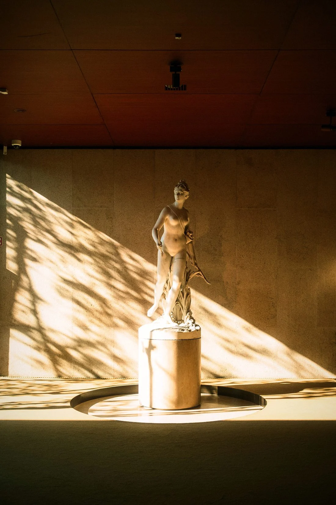
The identities we admire most share a strange quality: once you have seen them, it is hard to imagine the company looking any other way.
That feeling of inevitability is never an accident. It comes from weeks of writing, listening and discarding before a single letter is drawn.
Words before pictures
We begin every project with a single page: who the company is, who it serves and how it should sound. The design is simply that page made visible.
If you cannot explain the idea in one sentence, it is not ready to be drawn.
Julia Hartley, Creative Director
Test it on the boring things
A logo looks good on a poster. A real identity also looks good on an invoice, a favicon and a parking sign. We test on all of them before we present.
Leave a Reply